
Local Crate Case Study
The Design Process: Heuristic Analysis | Script Writing | Remote Usability Testing | In-Person Usability Testing | Raw Data Collection and Information Synthesis | Findings and Recommendations Reporting | Hand Sketching | Prototyping

Local Crate is a weekly subscription meal kit service for Minnesota and Illinois residents that can be customized to meet the nutritional needs and desires of individuals and families, specializing in fresh ingredients curated by regional farmers and recipes designed by highly regarded area chefs.
My team's mission wss to ensure that Local Crate’s goals and values are represented by its website, localcrate.com.


User Testing and “A-ha!” Moments
User testing was performed remotely by individuals, and in-person by a team. A script was prepared ahead of time based on goals provided by the company and heuristic evaluations. Each session was administered by a moderator providing instructions and tasks to complete, an observer who took the bulk of the notes, and other observers in another room with one-way glass.
Working in observation rooms and as a team on this project was an overall interesting and enriching experience.
Learning each other's work styles and how they best fit with one another was a memorable undertaking that I'm sure we'll all reflect on in future projects.
As I worked through different parts of the testing process, I was a little surprised to learn that my initial concerns were not all the same as what users were concerned with.
(Next time, I might try user testing prior to any heuristic analysis, since I often use heuristics again after user testing anyway in ranking severity of problems).
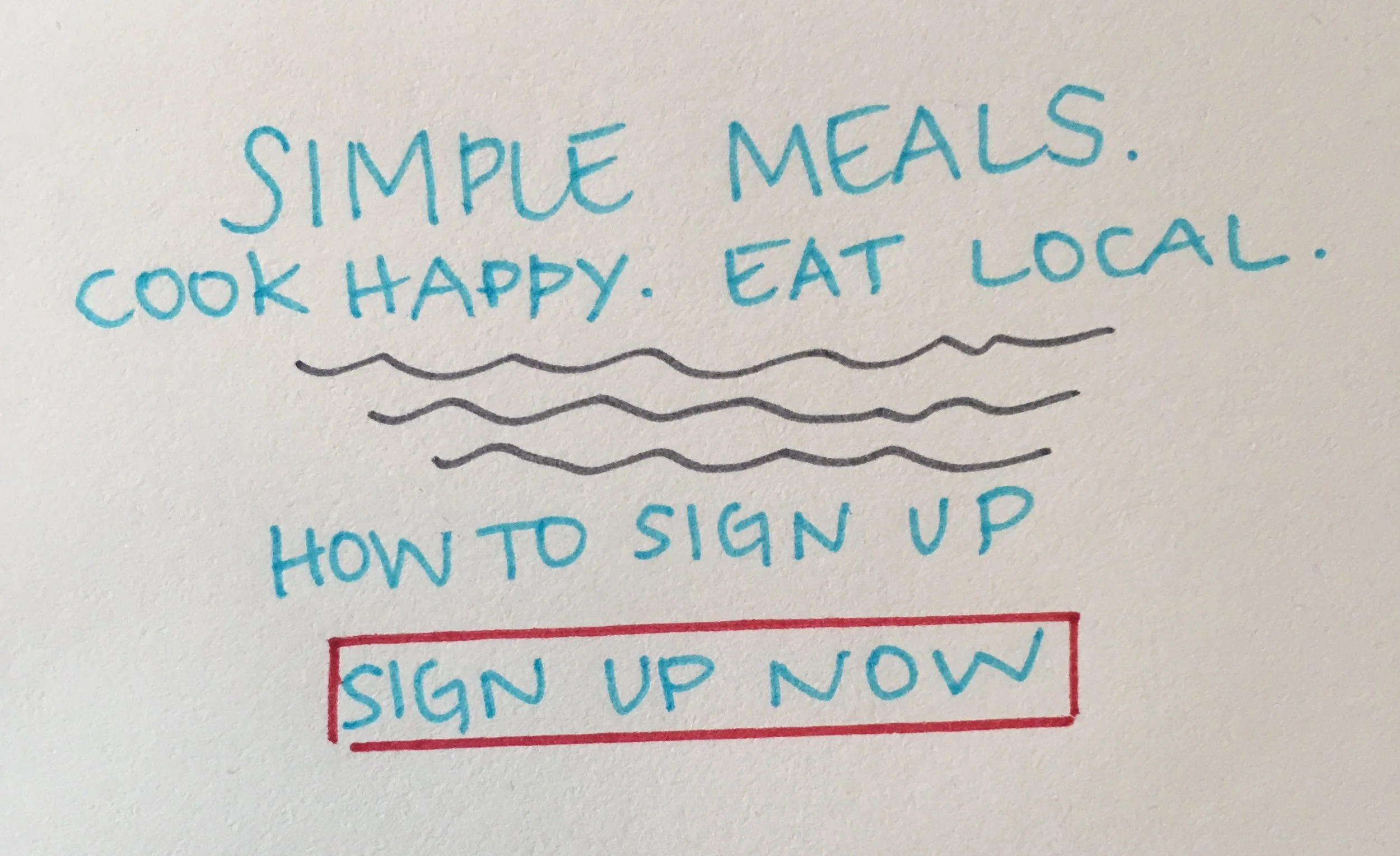
The highest priority item was revealed through testing to be the sign up process, in particular the sign up page.
Users found the format daunting because there were a large number of fields, and because the instructions dictating what information should be populated within each field disappeared, making it difficult to correct any errors if needed.


Seen above is a sampling of electronic card sorting done as a group after the in-person usability testing. Click on each thumbnail for an expanded view.


Improved, interactive prototyping
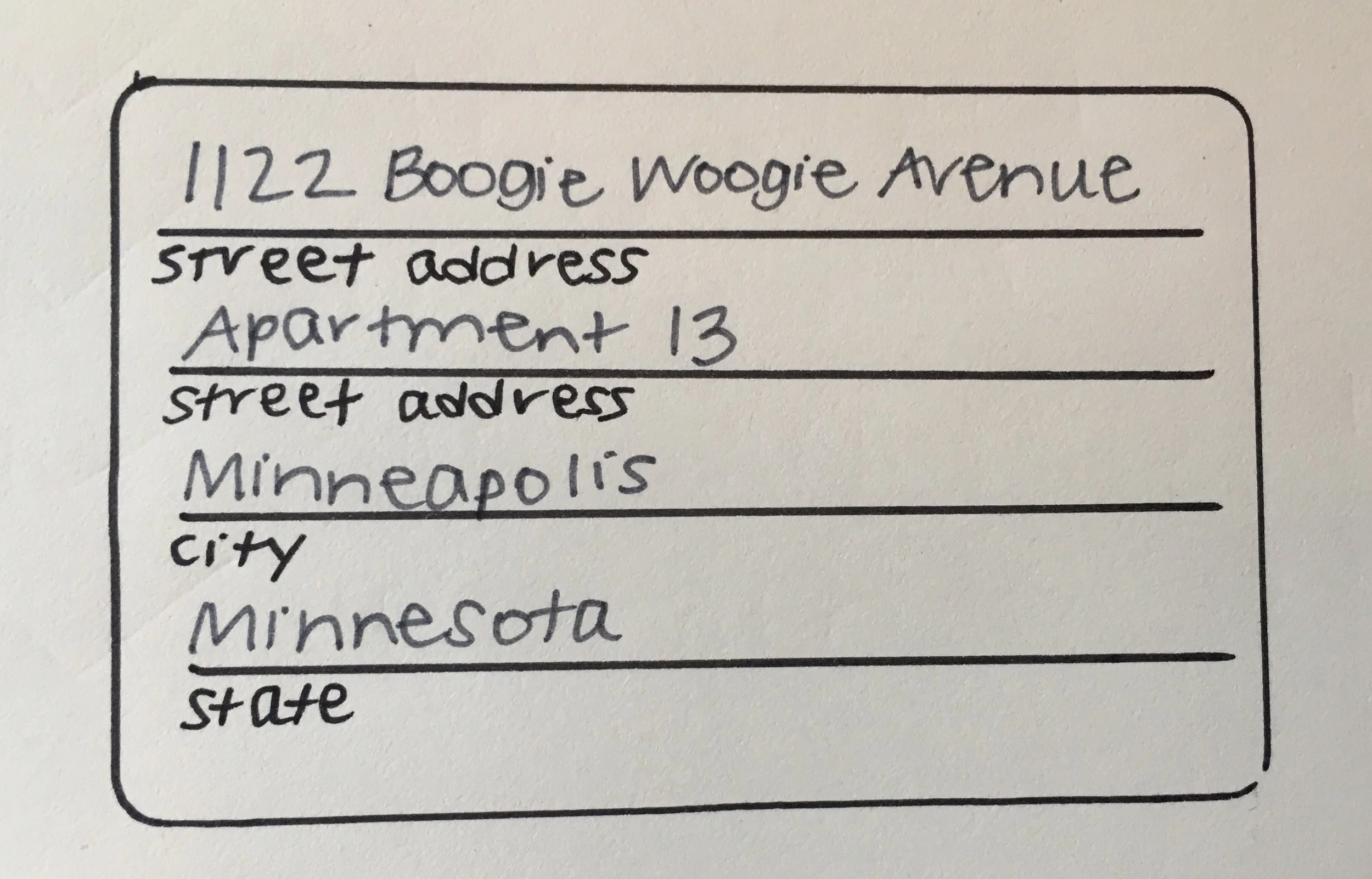
Above is shown the original sign up info page on the left, with a quick hand sketch in the middle and my improved, interactive prototype to the right.
I reduced the number of fields by combining items together in a way that made sense. The purpose of this change is to keep potential customers from becoming overwhelmed. I also re-labeled the boxes so that the instructions for what info goes into each field remains, even after information has been entered. Click on each thumbnail for an expanded view.
Discovering that what users were most concerned with wasn't exactly what I suspected at the beginning of this project was an eye-opener for me. I enjoyed working on the site and with participants I did not already know. I learned some new technology as well as the importance of having backup recording methods during testing.
Not only did the delicious-looking food on the site make me hungry - it also whet my appetite for developing my skills further on similar projects in the future.


This report is available as a downloadable PDF here.